A peek at some interesting data from the eHives


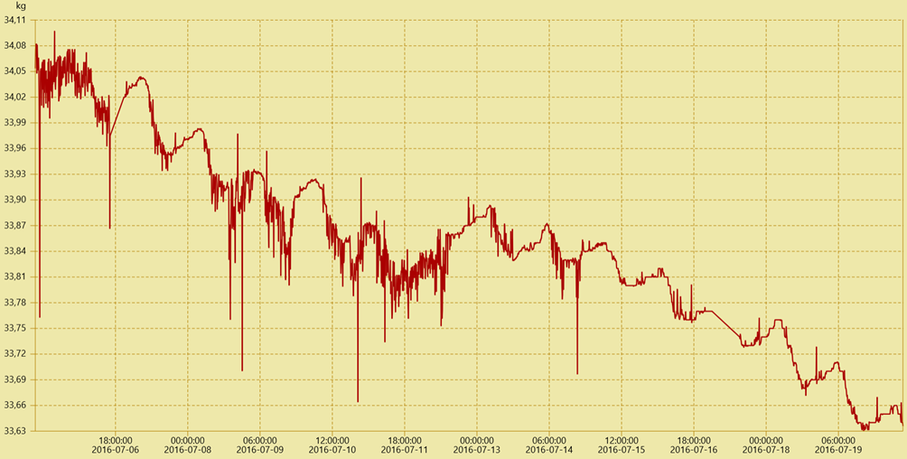
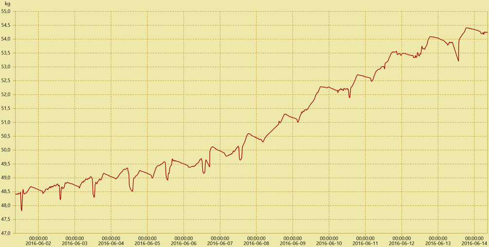
Both diagrams contain data from Summer (June/July), the main harvest season of the honey bee. First, a short description of the diagrams above:
In both charts the weight of the hive is plotted (vertical axis) and they both contain the data of two weeks (horizontal axis). The chart of the first hive (FKG) reveals a steady decrease of about half a kilogram in two weeks. During the same time interval, the weight of the second hive (GSC) rises by five kilograms. Interestingly, the weight always decreases during nighttime and the morning hours, while at the end of the day, the peak weight is higher than the day before.
A short explanation of these charts: Looking only at the GSC hive, the nightly weight decrease shows that the bees also need nourishment during this time. Therefore, they use some of the collected honey and the weight of the hive decreases. In the morning, many of the bees leave the hive for collecting nectar. This results in a steep decrease in weight and even allows an estimate of the number of field bees.
But this doesn’t explain the decrease in weight of the FKG hive. In fact, the data results from an intense infestation of the colony with varroa mites. This has two severe consequences for the colony. Firstly: The total number of bees decreases, since varroa mites mostly affect the brood and infested bees prefer to die outside of the hive to prevent passing the mites on to other bees. Secondly, the varroa mite severely damages the wings of the bees, resulting in a lower number of field bees. Thus, only very few nectar is acquired.
Therefore, the continuous decrease in weight of the FKG hive strongly suggests an infestation with varroa mites.
These charts are highly interesting from a scientific point of view and they show as well the advantage of having comparable E-Hives.
Our data poses a lot of interesting scientific questions. We invite you to work with the data of the eHives to discuss questions like the ones above. If you have any questions regarding this, just contact us.
(cb) 2017-02-09