Weather forecast by air pressure?
Idea
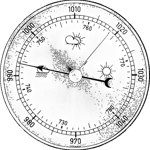
A small anecdote beforehand: While commissioning the eHive in Salzburg (see previous blog post) and the subsequent function test of all sensors, a BeeBIT member based in Würzburg (approx. 180 m above sea level) immediately noticed the suspiciously low air pressure of only about 970 mbar. Values around 1000 mbar are typical for Würzburg. The measurement error of the barometer installed in the weather station is 1 mbar (see blog entry of September 20th 2019). After a brief moment of shock at the potentially defective sensor, however, relief quickly set in: of course, Salzburg's topography (approx. 425 m above sea level) is responsible for the comparatively low air pressure. According to the barometric formula, at an air pressure of 1013.25 mbar at sea level and a constant temperature of 15 °C, pressures of 992 mbar (Würzburg) and 963 (Salzburg) are to be expected. In clear weather, the measured values are therefore perfectly normal. In fact, the barometric altitude formula could be verified at all eHive sites by averaging the air pressure over a representative period and comparing it to the value expected by altitude. The exponential dependence between pressure and altitude could thus be guessed from a graphical plot of pressure versus altitude even without knowing the correct formula. However, such a procedure is not the subject of this blog post.
In the winter months, the bee colony has usually completely ceased flight and brood activities. The colony survives the cold season in the form of a so-called winter cluster. Although periodic temperature rises can often still be observed in the hive, which serve to liquefy and consume the honey reserves, otherwise there is comparatively little to be gained from the data. Of course, this winter dormancy only applies to the bee colony; the weather station mounted on the eHive continues to send interesting data that can be evaluated and interpreted. In the following paragraphs, an attempt will be made to establish a relationship between air pressure and solar radiation. The starting point is the weather symbols (sunshine, clouds, rain) often found on simple barometers, which reveal the purpose of these barometers: They are used to predict the weather. Following a simple figurative idea, low air pressure attracts clouds from surrounding regions, while high pressure displaces the clouds and thus produces "nice" weather. Can we confirm this relationship using eHive weather data? If so, how reliable is this method?
The following investigation is the third contribution on the topic of data analysis after the articles of July 20th 2019 and September 22nd 2019. Once again, the Python3 programming language is used, but the calculations and graphical representations performed can also be implemented in other tools such as spreadsheet programs. The Python script and raw data downloaded by means of the BeeBIT diagram display are linked at the end of this article. In the script, you can follow all the calculations performed using the program instructions. The mathematical syntax follows the specifications of the NumPy library.
Data set 1: Autumn in Salzburg
Raw data over time
Following the above anecdote, we first evaluate data from the eHive in Salzburg shortly after its commissioning. In the period from October 14th to October 30th of this year, the data for air pressure and solar radiation were selected in the diagram display and downloaded by clicking on the download button. Data not needed at the beginning and end of the time range were deleted by hand, leaving 17 full days each from 00:00 to 23:59. All time data refer to the local summer time (UTC+2). Accordingly, the time range from 10/13 22:00 to 10/30 21:59 (UTC+0) is found in the data set. The raw data with daily mean values are plotted in Fig. 1.

In principle, we can already check our working hypothesis with the help of Fig. 1. Striking, for example, is the strong drop in air pressure beginning on day 6 of the measurement period. While on this day the solar radiation still reaches values of up to 500 W/m² (daily mean approx. 70 W/m²), the maximum value on day 7 drops to only about 200 W/m² (daily mean 20 W/m²). A dip in the observed solar radiation indicates cloudy or even rainy weather. The same phenomenon under reversed conditions can be seen from day 7 to 9: While air pressure increases approximately linearly from 955 mbar to over 980 mbar, a slight increase in daily mean solar radiation can be observed from day 7 to 8 and a significant increase from day 8 to 9. But is the correlation between air pressure and solar radiation really that simple?
Recognizing correlations
From day 14 on, the pressure drops almost linearly from 980 mbar to about 960 mbar. Nevertheless, the solar radiation remains almost constant. It can be assumed that the effect observed on days 6 to 9 was only a coincidence. To be able to quantify the degree of correlation between the plotted measured variables, we need a new plot. Building on the blog post from 09/22/2019, the data points of both measured values are plotted against each other, see Fig. 2.


In Fig. 2, for better comparability with other locations, all air pressure values were normalized so that the mean value over the entire time range corresponds to the value of 1013.25 mbar expected at sea level. Although this normalization could also be performed using the barometric altitude formula, since the air pressure curves of geographically close locations (all Central Europe north of the Alps) almost duplicate each other except for the altitude offset, this method was chosen, which does not require any further data such as the exact altitude of the eHive and the outdoor temperature.
First, the daily mean values of air pressure and solar radiation of the same day were plotted as crosses in Fig. 2a. A perfect linear correlation would exist if all measured values lie on a straight line. Under the assumption "high air pressure means nice weather", a positive slope is to be expected for the straight line. In fact, the shape of the registered measuring points deviates strongly from a straight line. With a little good will, a concentration around the diagonal line rising from the lower left to the upper right can be detected in the point cloud, which corresponds to the hypothesis. But there can be no question of a clear linear correlation. With imagination, almost any kind of curve fitting could be done for the point cloud, c.f. this relevant XKCD comic.
Linear regression and coefficient of determination
Nevertheless, to obtain a quantitative measure of the quality of the correlation, a compensation line was calculated using the least squares method and also plotted in Fig. 2a. In fact, a positive slope is obtained. From the so-called coefficient of determination R² of the linear fit, the degree of functional correlation between the examined measured values can be estimated. The coefficient of determination takes values between 0 and 1, where 0 corresponds to a completely uncorrelated distribution and 1 to a perfect linear relationship. For the regression line between air pressure and solar radiation a value of R²=12.9% is obtained. (For limitations and criticism of the coefficient of determination for estimating and finding a correlation, we refer to the corresponding Wikipedia entry. At this moment, we are content to point out that a high value of the coefficient of determination can also result from a spurious correlation and that there may be other variables that have not yet been considered. A statement about the statistical significance of the results has also not been made as of now).
The low value of the coefficient of determination found in Fig. 2a is consistent with the observation that the measured values are strongly scattered in the diagram and it is difficult to recognize a trend. Of course, a plot of the measured values of the same day as in Fig. 2a does not correspond to the original hypothesis, according to which the weather can be predicted by means of barometers. For this purpose, e.g., the solar radiation of the following day must be compared with the current air pressure, see Fig. 2b. A similar picture as before results, but a slightly better concentration of the measuring points around the main diagonal can be observed. Accordingly, the calculated value of the coefficient of determination R²=21.3% is higher. From the considered data set we can conclude within the framework of low statistical significance that the air pressure is apparently more suitable for the prediction of the solar radiation of the following day than of the current day (in agreement with the initial hypothesis and the simplified picture idea of sucked-in/displaced clouds). But how reliable is this conclusion really? Is it possibly a coincidence?
To answer this question, weather data from two other eHives in the same time range were first analyzed. The results are displayed when you move the mouse pointer over Fig. 2. For both additional eHives we proceeded analogously to the previous data set, including normalization of the air pressure averages. We now observe a completely different picture: Although the R² values in Fig. 2b are still higher than in 2a, the absolute values are significantly lower. ven regression lines with negative slope can be found. In addition, another regression line was drawn through the data points of all eHives (dashed black), which with R²<1% does not suggest a functional relationship. So are barometers with painted weather symbols bunk? This needs a more precise analysis.
First of all, it can be stated that the selected time range at the end of October is suboptimal. Towards the end of the year, the solar radiation decreases naturally. This effect was not compensated for and, with otherwise constant parameters, ensures a scattering of the measured values in the vertical direction. The size of the data set is also very small with 17 days. Thus, a statistically reliable statement can hardly be achieved. In addition, weather forecasting is known to be very complicated and air pressure is only one of many relevant parameters. It would be conceivable to improve the model by, for example, considering air humidity in addition to pressure. However, in order not to overcomplicate the presented analysis, we continue to restrict ourselves to air pressure as the only input parameter and instead extend the time domain. By selecting a data set around the summer solstice (June 22nd), we minimize the effect of seasonal changes.
Data set 2: Summer solistice in Würzburg
We consider the period from June 29th to July 16th 2021 of the eHive DEU-DHG-1 in Würzburg. Analogous to the previous procedure, the measured values were plotted against each other and a linear regression was calculated, see Fig. 3. First of all, the significantly higher absolute values of the solar radiation due to the solar maximum at the beginning of the summer are striking. Again, the higher R² value is obtained in Fig. 3b (i.e. when using the atmospheric pressure to predict the solar irradiance of the following day), even though the absolute value is still comparatively low with R²=16.6%. However, due to the larger data set in comparison to Salzburg a coincidental correlation can rather be excluded.


Again, by hovering the mouse pointer over Fig. 3, data of two further eHives from the same time range are displayed. Especially in Fig. 3b it can be seen that the correlation between air pressure and solar radiation is now no longer a coincidence, but can be observed in all data sets. For the eHive DEU-MNG-1 (location Mönchengladbach) a comparatively high coefficient of determination R²=27.8% is obtained. The consistently lower values of solar radiation in Munich (DEU-LPG-1) are striking. It is possible that the weather station is temporarily shaded by a nearby building or tree.
Conclusion and outlook
We conclude this blog post with the realization that the correlation between air pressure and "nice" weather is by no means as linear as some simple barometers suggest. Nevertheless, a weak correlation was found after the methodology of the evaluation was reconsidered. Here, in particular, the selection of a sufficiently large time domain around summer solistice has imposed itself.
The data analysis carried out can, of course, only provide a first insight into the subject matter. A multitude of further hypotheses can easily be formulated. For example, what is the effect of the air humidity already mentioned above? Is it perhaps useful to plot the change in air pressure from day to day (first time derivative) instead of the absolute value? Can a more precise prediction be made when comparing different locations? Such questions and others can be addressed in an analogous way. The size of the data set and the complexity of the methodology can be scaled almost arbitrarily.
The used script and raw data can be found in the appendix of this blog post. If you have any questions, suggestions or criticism about this post or the project in general, please feel free to contact us at any time.
Supplementary materials
- this blog post as PDF: weather_forecast.pdf
- raw data: data_weather.zip
- Python script: weather_forecast.py
(cw) 2021-11-01
eHive at University of Salzburg
On October 13th 2021 eHive No. 12 (new identifier: AUT-PLU-1) could be put into operation again. Maintained by the School of Education of the Paris Lodron University Salzburg the hive is expected to house bees and collect data in the southeast of the city until 2023.
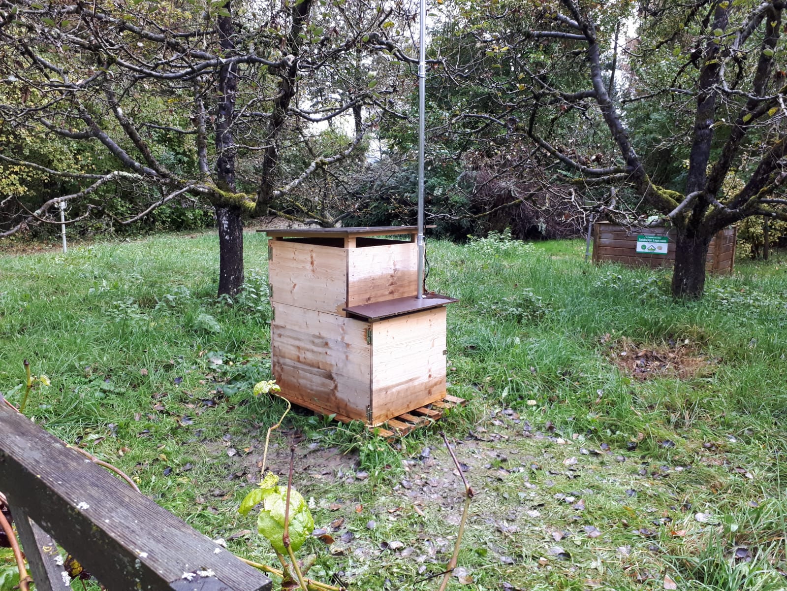
The eHive in Salzburg is to be used for the continuing education of prospective and already working teachers. In addition to the cooperation with Ludwig-Maximilians-Universität (LMU) Munich, this is already the second collaboration with a university institution. With the decisive involvement of the LMU, numerous teaching materials have been produced up to 2017 which can now be accessed free of charge on the BeeBIT website (see the Didactics tab in the site navigation menu). Back in March of this year staff from the School of Education in Salzburg published an article in the journal "Digital unterrichten Biologie" issued by Friedrich Verlag Hannover. The article is titled "Bee digital - Temperaturregulation der Honigbienen im Winter und im Sommer" (link to issue, German language only) and thematically deals with the evaluation of temperature data from inside a beehive compared to the outside temperature. The diagram viewer of the BeeBIT website was used for visualization and analysis.
The data collected from the hive in Salzburg can, of course, be viewed and accessed free of charge as before on the BeeBIT website. As with the other eHives, you can thus form an impression of the inside of the hive at any time from the comfort of your own home and in real time, as well as track environmental influences such as weather or air pressure.
We like to thank the persons in charge on location and wish much success in working with the eHive system.
(jg,ds,cw) 2021-10-31
A new system for teaching materials
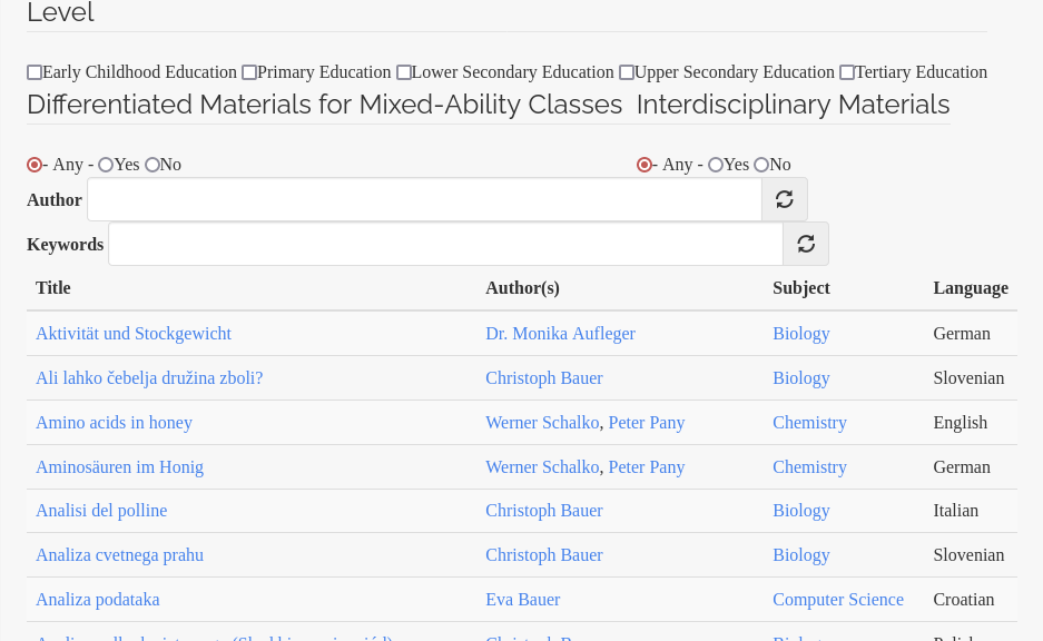
BeeBIT has always relied on the commitment of interested teachers to prepare the data collected by the eHives for teaching in schools. As a handout, we provide a large number of elaborated lessons for free download. The materials cover all science subjects from mathematics to computer science, physics, chemistry, biology and geography. Whether elementary school or high school, suitable questions and difficulty levels can be filtered in our database, viewed, downloaded and then edited if necessary. (All teaching materials are offered as docx files to allow teachers to make adjustments based on the curriculum and students' qualifications).
In addition to the freely available worksheets, there is a protected area on our website that contains suggested solutions and materials specifically intended for teachers, which can only be accessed after registration. BeeBIT checks once whether new users are authorized to access these materials based on their professional background. This prevents crafty students from unauthorizedly downloading the solutions to the worksheets. The system for managing and downloading the lessons has not been further developed since 2016.
The new system
After launching the modernized BeeBIT website in March 2019, the provisional nature of the old system became more and more obvious and the association decided to tackle a modernization. After a long time and several attempts, we can finally announce the launch of the new user interface. You can find it in the navigation menu of the site under the tab 'Didactics'. Besides a more appealing visual design, some new or improved functionalities could be implemented, which will be briefly explained in the following. To conclude this blog post, we would like to give a small insight into the spectrum of available materials. The goal is to motivate readers to discover the materials on their own.
Presentation and Navigation
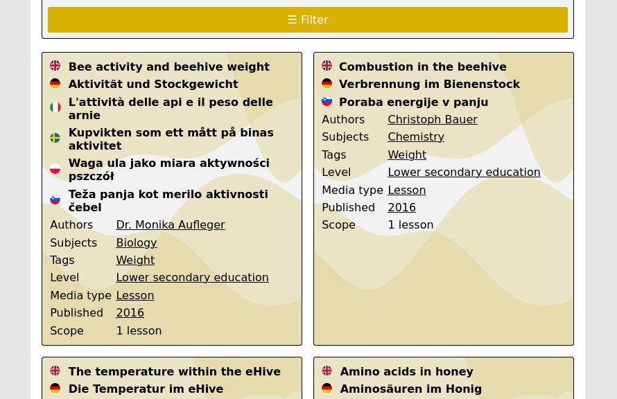
As can be seen in the screenshot above, all materials are now displayed by default in grouping of all available languages. This makes it easy to see whether a suitable translation is available. In addition to the title, further information such as author, subject or tags are listed directly, enabling a quick overview without requiring the explicit opening of individual files. By clicking on property values marked with a black underline, a filter is activated that only displays materials with the same value. Clicking on the colored module card of each material takes you to the detailed view including a brief description and the links to download.
Related materials / Suggestions
In the detailed view, related materials from our database are automatically listed at the bottom of the screen. If the selected lesson suggestion does not quite meet your needs, it is worth taking a look at this listing. Although the suggestions are generated in different categories (author, subject, tags), we have made sure that there are no annoying duplications in the suggestions.
Login system
Access to the teaching staff area is restricted by a login (as in the old system). However, a user session is now valid on the entire BeeBIT homepage (with the exception of the diagram viewer). While the site does not yet effectively take advantage of such an overarching system, future scenarios are conceivable that could require a login to unlock supplemental materials in other areas of the site as well. Teachers who do not yet have an account can easily register. Please note that the login data could not be transferred from the old system. For a short transition period, both systems will be operated in parallel. Nevertheless, we ask all those affected to register for the new system. A renewed check of your access authorization will not be necessary.
A peek into available materials
Representative of the large number of teaching units in our database, three examples will be presented to give a rough overview of the scope, orientation and content of the materials.
Forest or flower honey
The first lesson stems from a physical-chemical area. The students receive an introduction to the methodology for measuring the electrical conductivity of a liquid. The conductivity can be used to distinguish between different types of honey. Quote from the introductory section of the worksheet:
Electrical conductivity is considered to be one of the best parameters for analysing and authenticating honey, and differentiating between honey made from nectar (“blossom” or “flower honey”) and honey made from honeydew (“forest honey”). It is the origin that determines the composition of the honey – and hence its electrical conductivity. According to the guidelines of the International Honey Commission (IHC), the electrical conductivity of honey is defined as that of a 20 % weight in volume (w/v) solution in distilled water at 20 °C, where the 20% refers to honey dry matter (dry matter basis). The result is expressed in microSiemens per centimetre (µS/cm). Honeys with an electrical conductivity of more than 800 µS/cm are labelled honeydew or forest honeys. The electrical conductivity values of mixtures of forest and flower honeys range between 600 and 800 µS/cm. Pure flower honeys show electrical conductivity values between 350 and 600 µS/cm. If the electric conductivity value is below 250 µS/cm, this might indicate that the bees have been artificially fed with sugar and such honey is banned by Departments of Health and Food Safety in many countries.
If the water content of the honey to be tested is known (see related experiment Water in honey), the dry mass required for the experiment can be weighed out. Only with precise weighing one receives a comparable value of the electrical conductivity after dissolving the honey in distilled (!) water. By measuring different types of honey, the students should validate the values claimed in the introductory text. How can an unacceptable dilution of the honey be excluded using the learned method? Is there a correlation between colour and electrical conductivity of the honey?
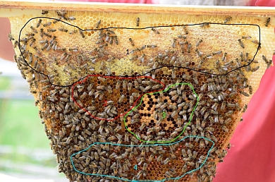
Bee larvae
In this strongly biologically influenced lesson, the students should first learn about the spatial organization of a honeycomb using the photo below and an explanatory text. Then, the temperature inside a beehive is investigated. Based on the measurement data of the eHives, students should compare the inside and outside temperature. What is noticeable at the time of brood? Can the position of the brood combs be determined from the temperature curves? The author gives the following hint:
The bees have to maintain a constant temperature of 35°C in the hive, so that the larvae can develop into adults.
(Note: For a more in-depth analysis of the eHive data, we refer to posts in this blog. For example, an analysis using the Python3 programming language is presented in detail in the posts of 07/20/2019 and 09/22/2019).
The bee database (part 1/3)
The topic of databases in the subject of computer science is, from experience, a rather dry undertaking for many students. The author of the last material presented here has designed three practical lessons, the first of which is presented as an example.
The data collected by the eHives is stored in an SQL database and can also be displayed via the diagram viewer using SQL queries. Starting from real measured data, basic elements of the syntax are introduced and learned in small practical questions. From the table of the outdoor temperature sensor, for example, the highest and lowest temperature ever measured in the observation period can be queried quite easily.
Parts 2 and 3 of the teaching module deal with increasingly complex questions but at the same time allow the investigation of more interesting correlations. For example, can a correlation be derived between weather and the development of stick weight? What SQL queries can be asked to help answer the question?
(cw) 2021-10-03
Newsletter June 2020
We are happy to announce the publication of our latest newsletter. You can download the PDF by clicking on the teaser below.
(team) 2020-06-08
The eHives' locations and surroundings
The following article gives a brief overview about the eHives' locations and surroundings in tabular form. The position of the weather station and its appendant wind sensor are described in a few words. For both, the first value in the table denotes the mounting height. It was tried to uniformely position the weather station and its wind sensor two respectively five meters above ground. However, due to the local situation this was not possible everywhere.

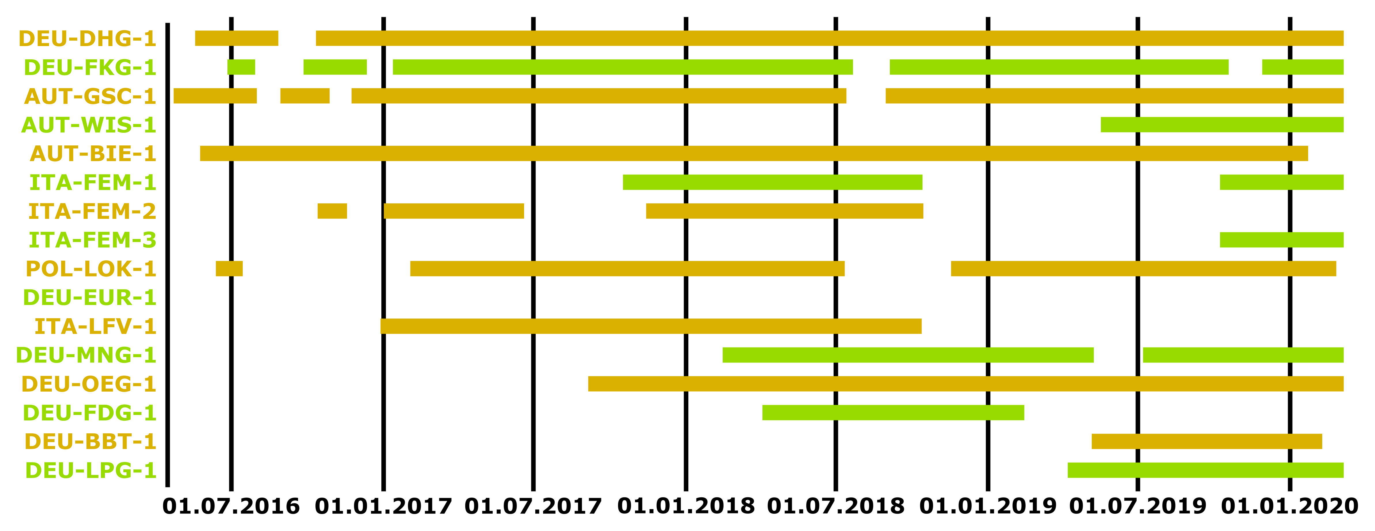
DEU-DHG-1 & DEU-FKG-1
| Activity period | DEU-DHG-1: 12.05.2016 - DEU-FKG-1: 27.06.2016 - |
| eHive Version | 0.2.2, since 21.08.2018: 0.2.1 |
| Coordinates | 49.79, 9.92 |
| Surroundings | lawn, partially covered by trees behind the hives, located in close distance to a small garden shelter |
| Weather station | 2 m, mounted in close distance to several trees |
| Wind sensor | 5 m, about the height of the trees' crowns |
| Covered by a roof? | ✗ no |
AUT-GSC-1
| Activity period | 23.04.2016 - |
| eHive Version | 0.2.2, since 2019: 0.2.1 |
| Coordinates | 48.20, 16.39 |
| Surroundings | roof of a three-storey house, nearby building behind the eHive is one level higher |
| Weather station | 1 m, mounted on the eHive's roof |
| Wind sensor | 1 m, mounted on the eHive's roof |
| Covered by a roof? | ✓ yes |
AUT-WIS-1
| Activity period | 18.05.2019 - |
| eHive Version | 0.2.1 |
| Coordinates | 48.24, 16.415 |
| Surroundings | green area, hive is covered by trees, located in close distance to a building |
| Weather station | 4 m, mounted on the edge of a balcony, a bit lower than the rooftop |
| Wind sensor | 5 m, mounted on the roof gable |
| Covered by a roof? | ✗ no |
AUT-BIE-1
| Activity period | 25.05.2016 - |
| eHive Version | 0.2.2 |
| Coordinates | 48.26, 16.48 |
| Surroundings | below a roof overhang directly in front of a building |
| Weather station | 1 m, in front of small bushes |
| Wind sensor | 2 m |
| Covered by a roof? | ✓ yes |
ITA-FEM-1 & ITA-FEM-3
ITA-FEM-3 currently under the name ITA-FEM-2
| Activity period | ITA-FEM-1: 18.10.2017 - 13.10.2018 under the name AUT-WIS-1, 09.10.2019 - ITA-FEM-3: 09.10.2019 - |
| eHive Version | ITA-FEM-1: 0.2.2, since 09.10.2019: 0.2.1 ITA-FEM-3: 0.2.1 |
| Coordinates | 46.07, 11.23 |
| Surroundings | terrace, distance to a nearby building approx. two meters |
| Weather station | 1 m above the terrace's height level, at the edge of the terrace 5m away from the building, 4 m above the ground level of the lawn in front of the terrace |
| Wind sensor | 7 m above the terrace, a bit higher than the nearby building |
| Covered by a roof? | ✗ no |
ITA-FEM-2
| Activity period | 02.01.2017 - 14.10.2018 |
| eHive Version | 0.2.2 |
| Coordinates | 46.36, 10.92 |
| Surroundings | lawn, located at a hillside |
| Weather station | 2 m |
| Wind sensor | 4 m |
| Covered by a roof? | ✗ no |
POL-LOK-1
| Activity period | 03.02.2017 - 11.07.2018 under the name POL-LOK-2, 18.11.2019 - |
| eHive Version | 0.2.2, since 18.11.2019: 0.2.1 |
| Coordinates | 50.57, 21.67 |
| Surroundings | inside a garden, in front of a fence, surrounded by bushes |
| Weather station | 2 m |
| Wind sensor | 4 m |
| Covered by a roof? | ✗ no |
DEU-EUR-1
currently under the name DEU-BGT-1
| Activity period | - |
| eHive Version | 0.2.2 |
| Coordinates | 49.67, 10.04 |
| Surroundings | inside a small open shelter that is limited by a building and a wall in two opposite directions |
| Weather station | 2 m |
| Wind sensor | 3 m |
| Covered by a roof? | ✓ yes |
ITA-LFV-1
| Activity period | 29.12.2016 - 12.10.2018 |
| eHive Version | 0.2.2 |
| Coordinates | 46.38, 11.24 |
| Surroundings | inside a bee house |
| Weather station | 4 m, directly above the rooftop |
| Wind sensor | 5 m, approx. one meter above the rooftop |
| Covered by a roof? | ✓ yes |
DEU-MNG-1
| Activity period | 15.02.2018 - |
| eHive Version | 1.1 |
| Coordinates | 51.19, 6.44 |
| Surroundings | roof terrace at the height of the second floor, the terrace is enclosed by the building which is two floors higher in two opposing directions and one floor higher in the two remaining directions |
| Weather station | 2 m |
| Wind sensor | 4 m |
| Covered by a roof? | ✓ yes |
DEU-OEG-1
| Activity period | 06.09.2017 - |
| eHive Version | 1.1 |
| Coordinates | 53.10, 8.92 |
| Surroundings | roof terrace of a two-storey building, the roof enclosing the terrace is approx. one level higher |
| Weather station | 2 m |
| Wind sensor | 5 m |
| Covered by a roof? | ✓ yes |
DEU-FDG-1
| Activity period | 03.04.2018 - 13.02.2019 |
| eHive Version | 0.2.1 |
| Coordinates | 49.97, 9.13 |
| Surroundings | lawn, located near some buildings |
| Weather station | 2 m |
| Wind sensor | 5 m, located near a three-storey building |
| Covered by a roof? | ✗ no |
DEU-BBT-1
currently under the name DEU-FDG-1
| Activity period | 07.05.2019 - 08.02.2020 |
| eHive Version | 0.2.1 |
| Coordinates | 49.79, 9.88 |
| Surroundings | garden, a few meters in front of a house, covered by a tree |
| Weather station | 2 m, in three meters distance to the house |
| Wind sensor | 3 m, in two meters distance to the house |
| Covered by a roof? | ✗ no |
DEU-LPG-1
| Activity period | 08.04.2019 - |
| eHive Version | 1.2 |
| Coordinates | approx. 48.14, 11.59 |
| Surroundings | - |
| Weather station | 2 m |
| Wind sensor | 5 m, near a three-storey building |
| Covered by a roof? | ✓ yes |
(jg) 2020-03-15
 DE
DE